B2B Commercial Banking Application Redesign
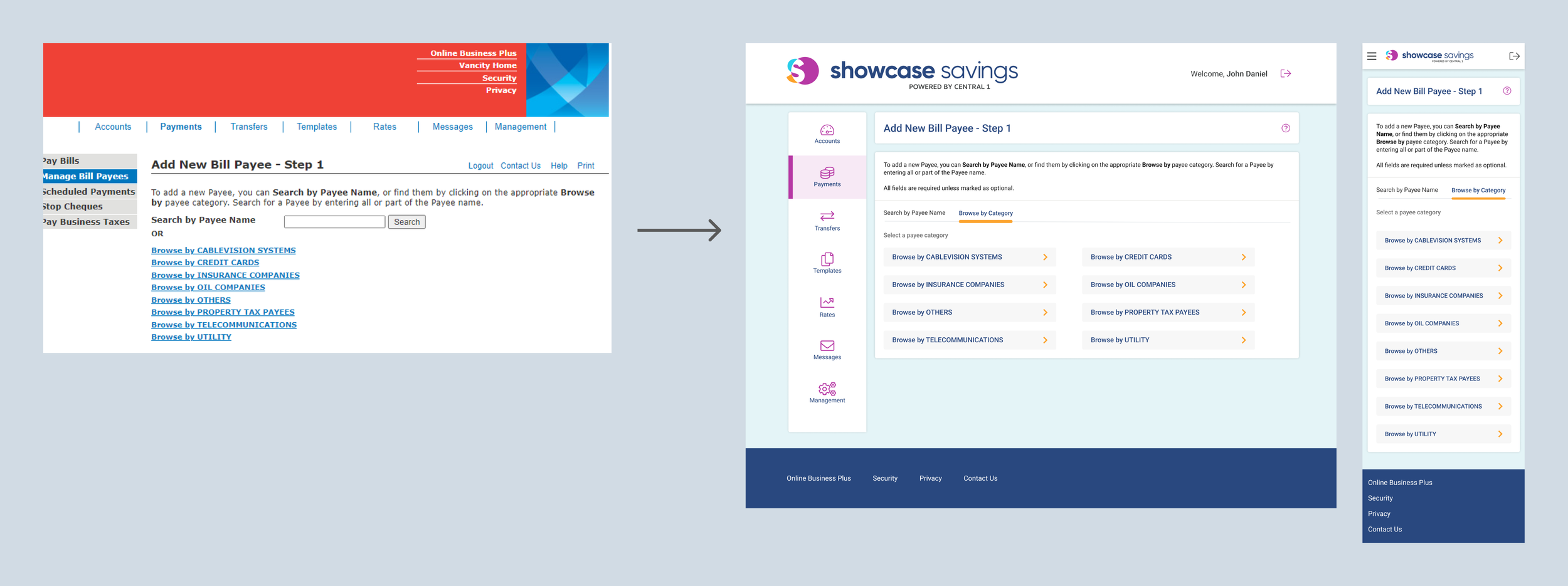
Forge Commercial is Central 1's digital banking solution for medium-to-large enterprises. I led the B2B redesign to align with Forge Retail UX/UI standards, enhancing mobile responsiveness, ensuring accessibility compliance, and preserving existing functions. This project focused on modernizing the user experience for business clients and improving workflow efficiency without adding new features.
My Role
Solo UX/UI Designer
Team
• 1 UX/UI Designer
• 1 Accessibility Specialist
Client
Multiple Credit Unions
Time
October 2021 - May 2022
(From Research to UAT support)
Background
The Forge Commercial online banking product, developed over 10 years ago on a separate platform, faced significant challenges due to its outdated codebase. This extensive redesign targeted about 20 features across over 100 final mockup pages, aligning the platform with Forge Retail to enhance both responsiveness and accessibility. Such updates were critical for adapting to the evolving demands of digital banking.
Process
Research & Analysis
User Research
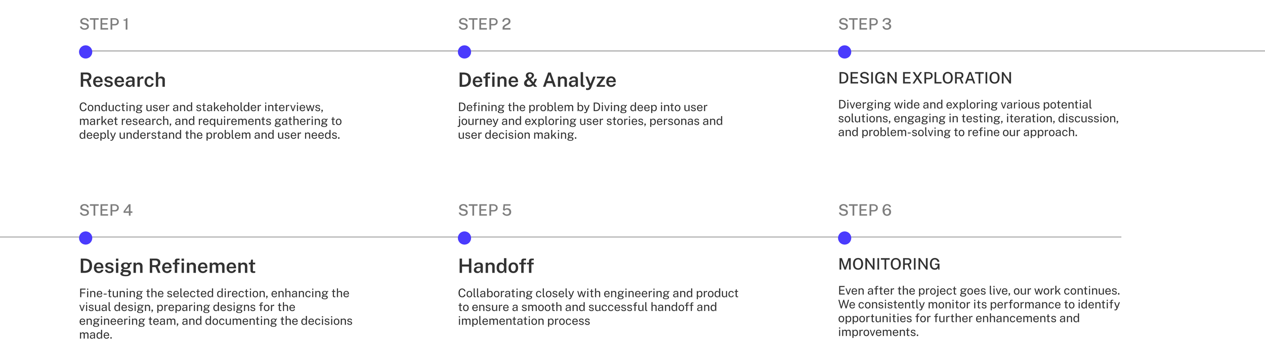
Initial Review: Met with the product owner to discuss requirements.
User Interviews: Conducted interviews with key stakeholders, including financial analysts and product owners, to understand their specific needs and pain points.
Usability Testing: Performed tests to examine interaction experiences.
Feedback Collection: Participants completed the System Usability Scale (SUS) questionnaire.
Outcomes: Integrated qualitative and quantitative data to identify improvement areas and measure user satisfaction.
Main Goals
• Retain Forge Commercial’s platform's existing functionality and navigation without adding new features.
• Introduce a responsive mobile design, making the previously non-responsive app fully mobile-friendly.
• Ensure accessibility compliance, meeting AODA standards.
Challenge #1: Multi-Payment Interface Redesign
Initial Design Overview: The Legacy System
Context
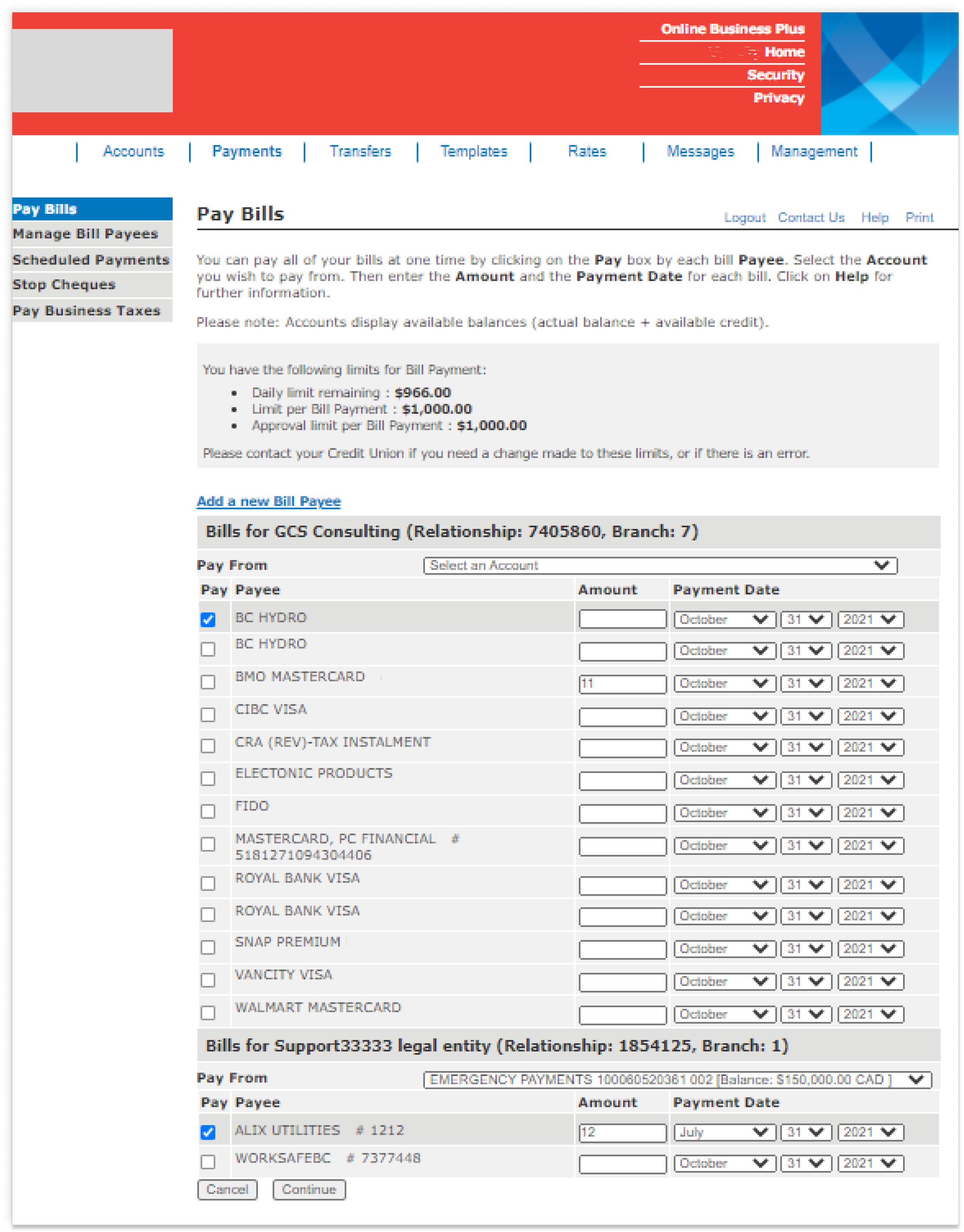
The original 'Pay Bills' page allowed users to manage and submit multiple bill payments simultaneously. However, its decade-old design led to a cluttered interface that was challenging for users to navigate.
Challenges
• The page was visually overwhelming and inefficient with all payee rows displayed by default.
• Although all fields were enabled all the time, users needed to select a payee's checkbox to submit payment; simply entering the amount and date was insufficient.
• Design was not responsive, creating barriers for mobile users
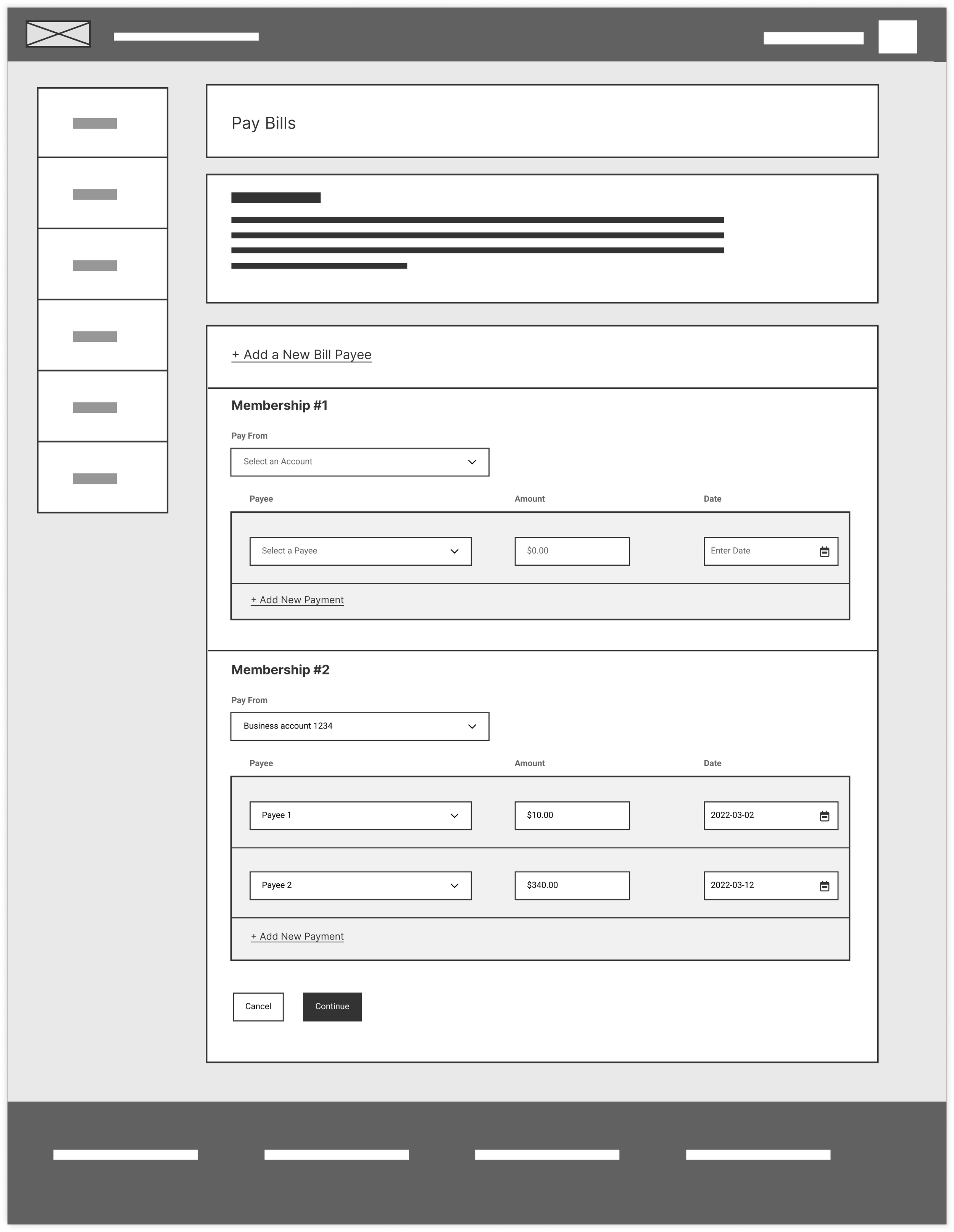
Iteration 1: Initial Redesign
Objective
Create a cleaner, more manageable and usable layout.
Approach
• Designed an interface using progressive disclosure, starting with one default row per membership and allowing users to add more rows as needed, reducing initial information overload.
• Eliminated checkboxes
• Included a date picker to streamline data entry, improve accuracy, and save space
Outcome
The cleaner design was well-received for its simplicity. However, feedback highlighted a preference for visible payee names for frequent transactions and the need to revert to segmented date fields due to technical limitations.
Iteration 2: Stakeholder Feedback Integration
Objective
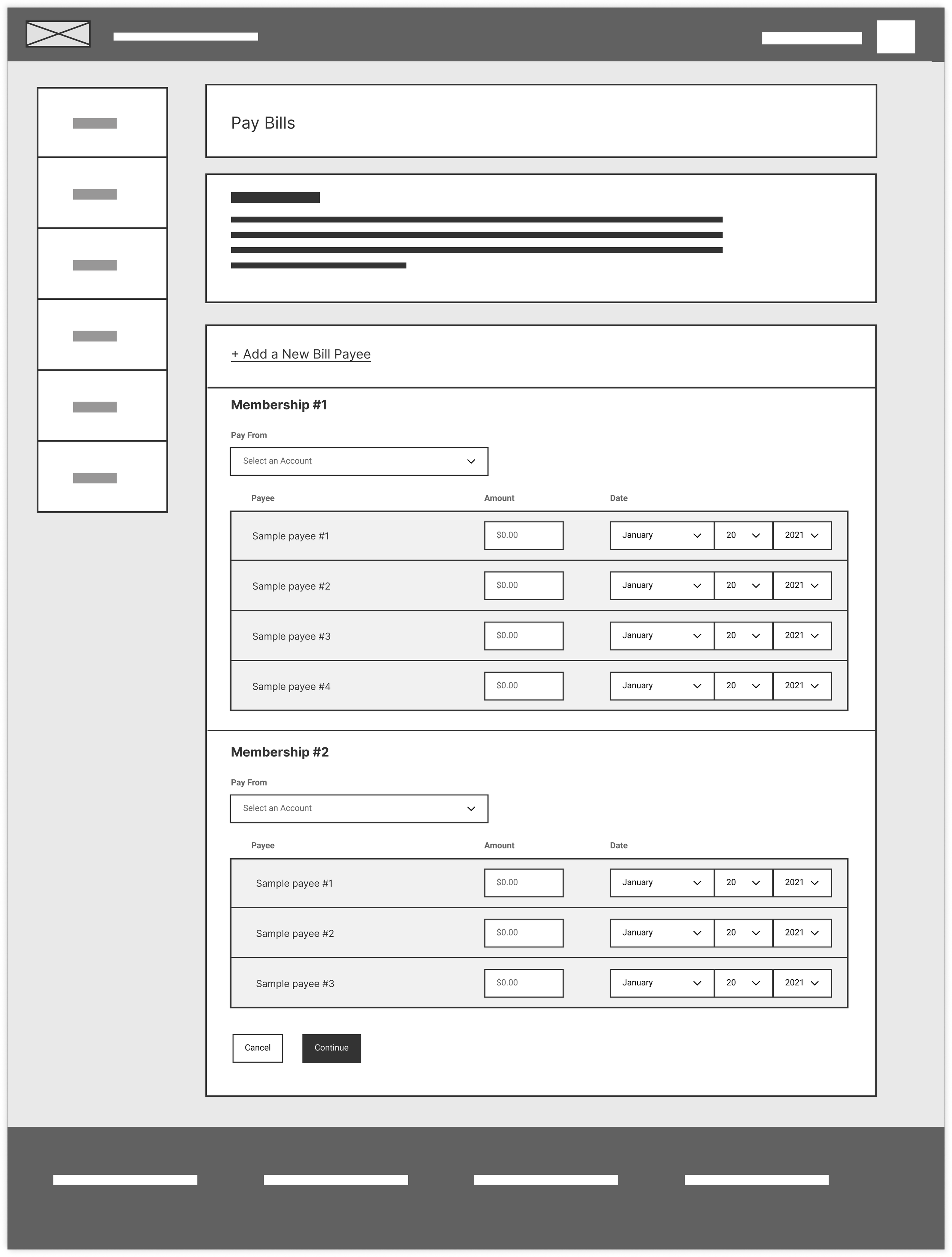
Adapt design to match end-user habits and technical constraints as per feedback:
• Stakeholders indicated a preference for viewing all payee names by default for ease of multiple bill payments
• Dev team highlighted the current technical limitation of implementing a new date picker feature.
Approach
• Modified design to display all payee names by default, as users frequently pay multiple bills.
• Reinstated segmented date fields as per development constraints.
Outcome
The design better matched user habits, but it still needed to meet accessibility standards.
Iteration 3: Accessibility Enhancement
Objective
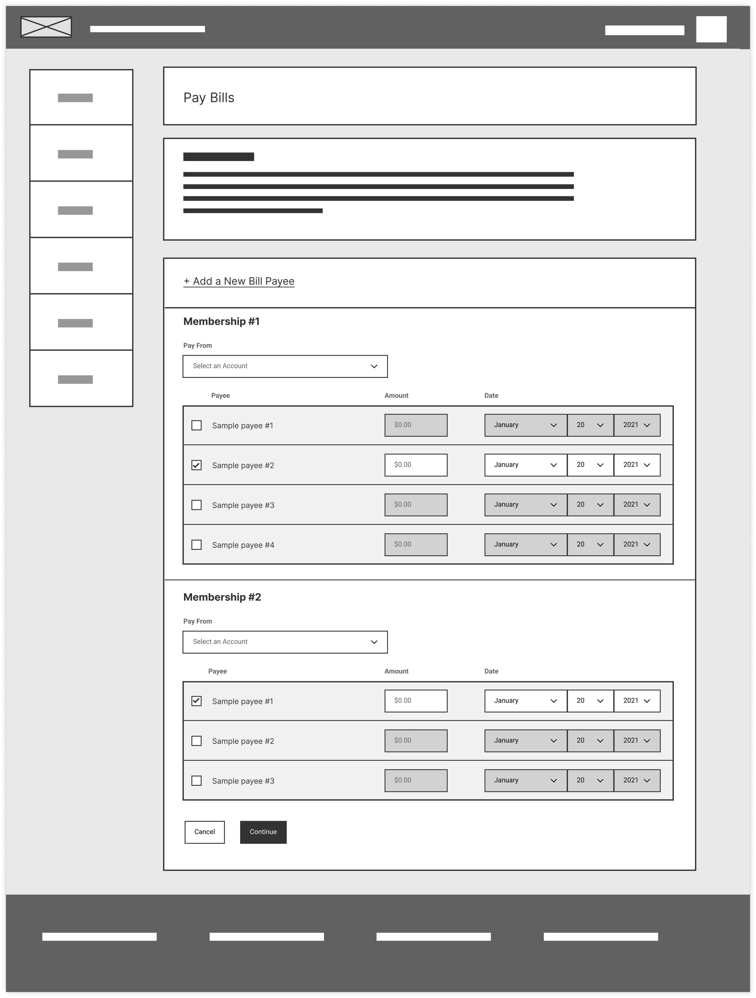
Resolve the accessibility issue where all fields were enabled and read by screen readers before action buttons, violating accessibility guidelines.
Approach
Implemented a design where payment rows start disabled and activate upon checkbox selection, streamlining screen reader navigation.
Outcome
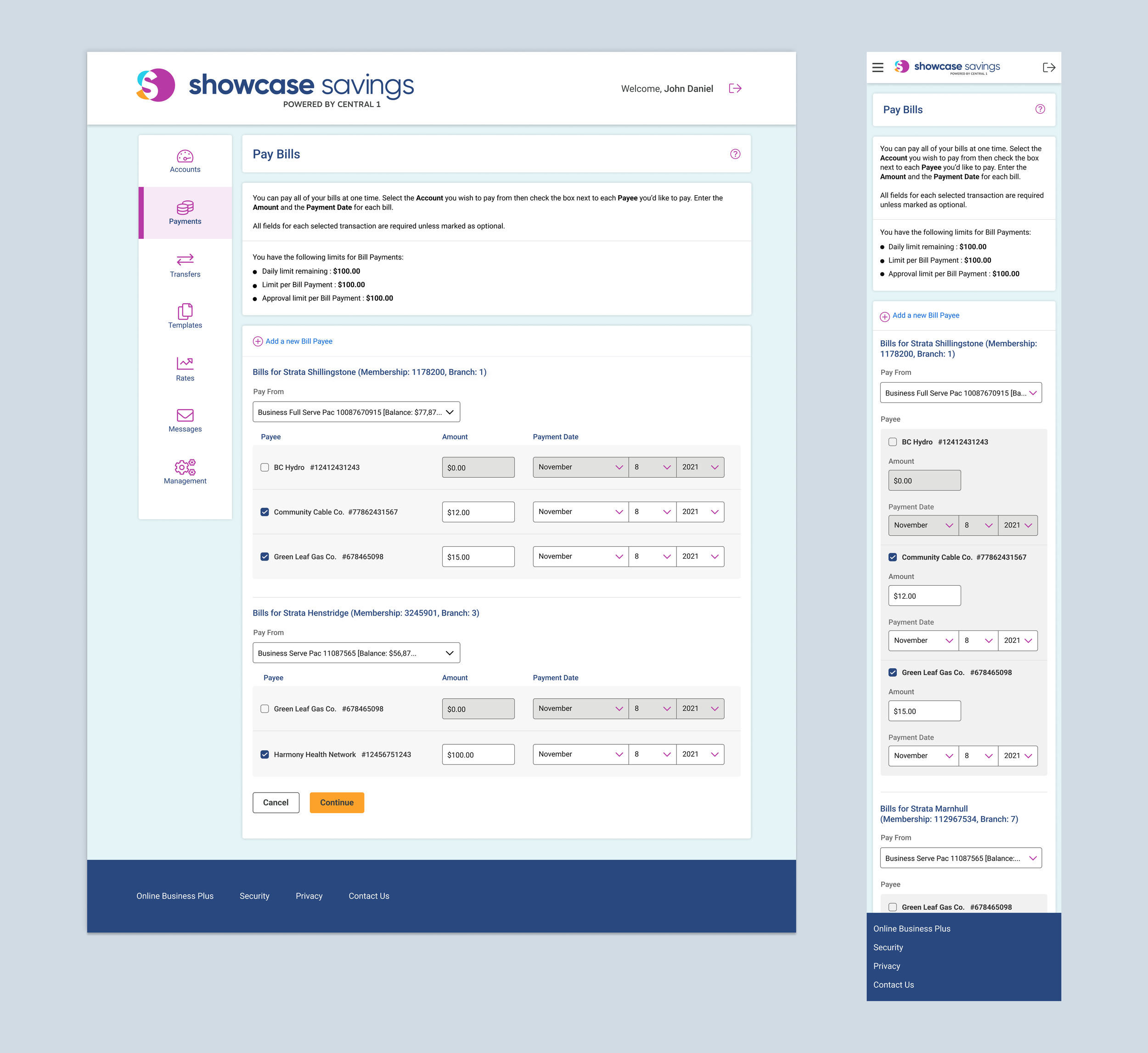
This adjustment ensured the final design adhered to accessibility standards, offering an improved and inclusive user experience.
Final Design
Challenge #2: Responsive Data Table
Initial Design Overview: The Legacy System
Context
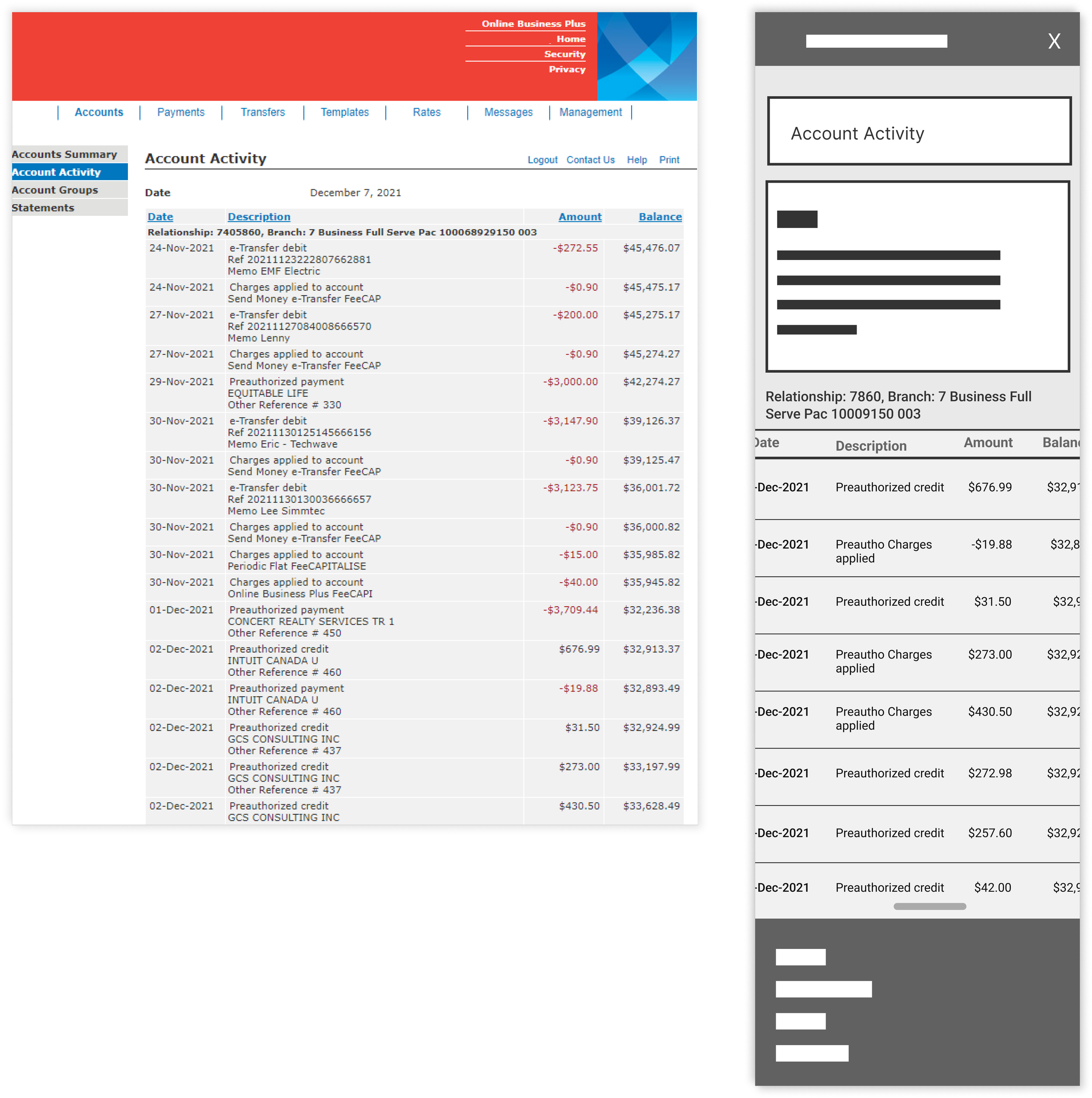
Given the legacy system's lack of responsiveness, there was initially no mobile design for the Account Activity table. In response to this gap, the development team and product owner suggested a time-efficient workaround. They proposed making the table horizontally scrollable with a scrollbar. This approach, while not fully responsive, was quick to implement. It involved utilizing swipe gestures to navigate through the table horizontally.
Challenges
Upon further exploration of the horizontally scrollable table solution suggested by the development team, I created a low-fidelity prototype and conducted internal testing. This investigation revealed significant usability issues with this approach:
• Users became frustrated with the need to scroll both horizontally and vertically, especially as the volume of data increased.
• The legend became inaccessible and invisible to users after scrolling, causing confusion and diminishing the overall user experience.
Iteration 1: Card Design
Context
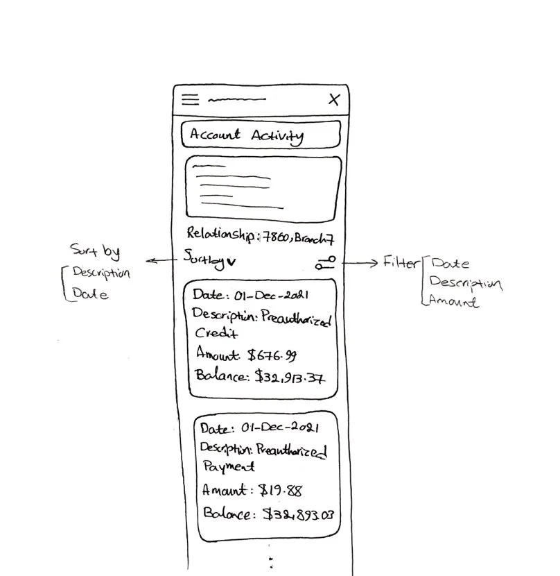
The foundational concept was to transform table rows into individual cards. This approach presented several advantages:
• Enhanced usability with large datasets by making the information more manageable.
• A flexible format for presenting data, adaptable to various content types.
Challenges
• The necessity to repeat column names across cards, which could lead to visual redundancy and user confusion.
• The development team explained that adding sort and filter options wasn't possible right now. This meant that for large amounts of data, users would have to scroll a lot to find what they're looking for, made worse by the large space taken up by each card and its borders.
• Considering these issues, the development team preferred keeping the traditional data table design over shifting to cards, due to usability and practical implementation concerns.
Iteration 2: Refine Table Design For Mobile
Context
Returning to the drawing board, I reevaluated my initial thoughts during the discovery phase. My updated approach involved reimagining the mobile table design where the Date is highlighted in each row, while the Amount and Balance details are neatly stacked for a cleaner look. To further ensure clarity and ease of understanding, the Balance was given a distinct color. Although visual labels were eliminated to streamline the design, they were preserved for screen reader accessibility, maintaining inclusivity.
Outcome
This concept, after thorough discussion with the development team and subsequent usability testing, garnered positive feedback. The revised design was not only user-friendly but also presented information in a clear and accessible manner.
Room for Improvement
To further enhance usability and user satisfaction, the following enhancement is on our radar:
Filter and Sort Features: Future updates will introduce advanced filter and sort capabilities. This addition aims to streamline the user experience by enabling more intuitive navigation and quicker access to relevant information.

SUS Score Evolution
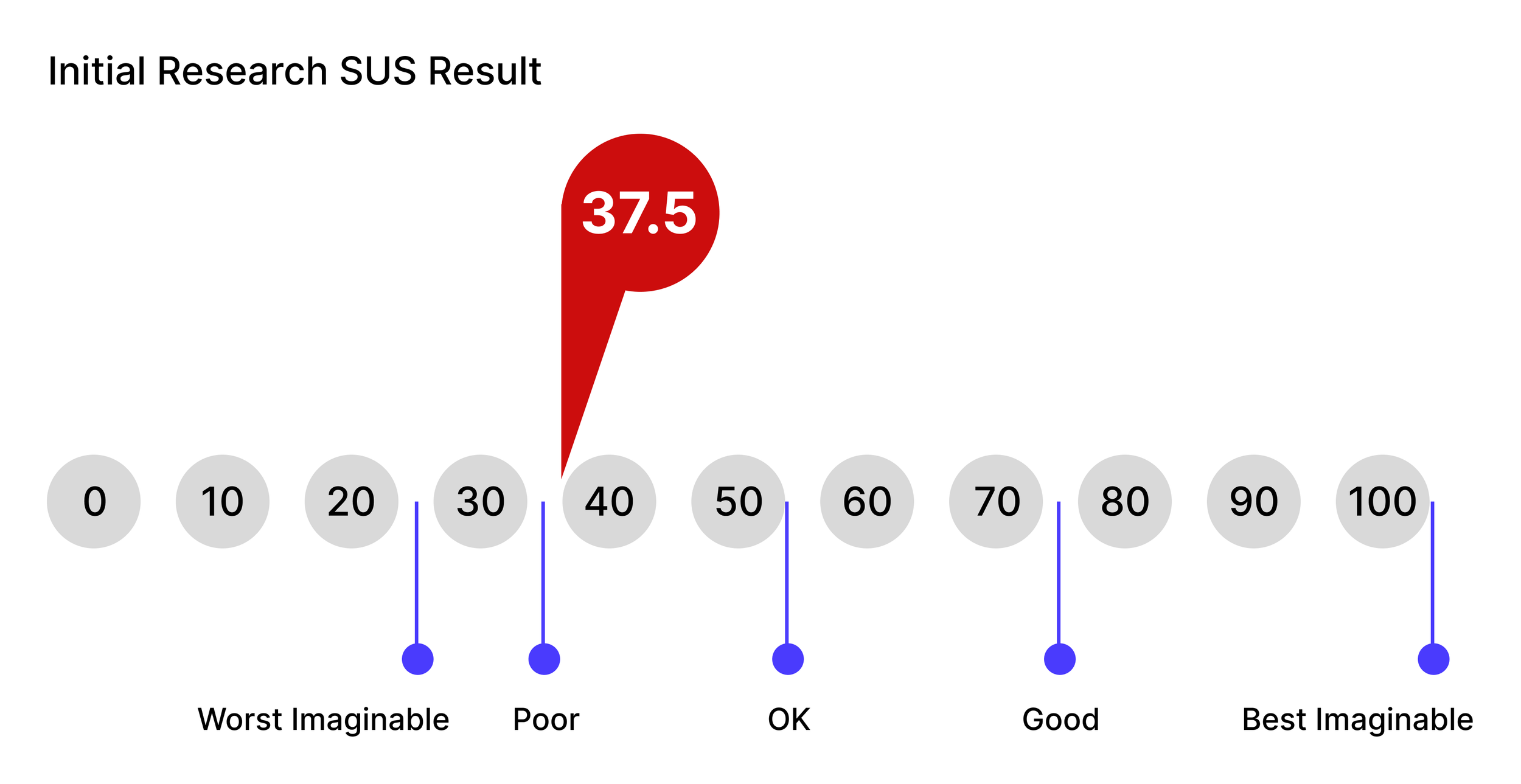
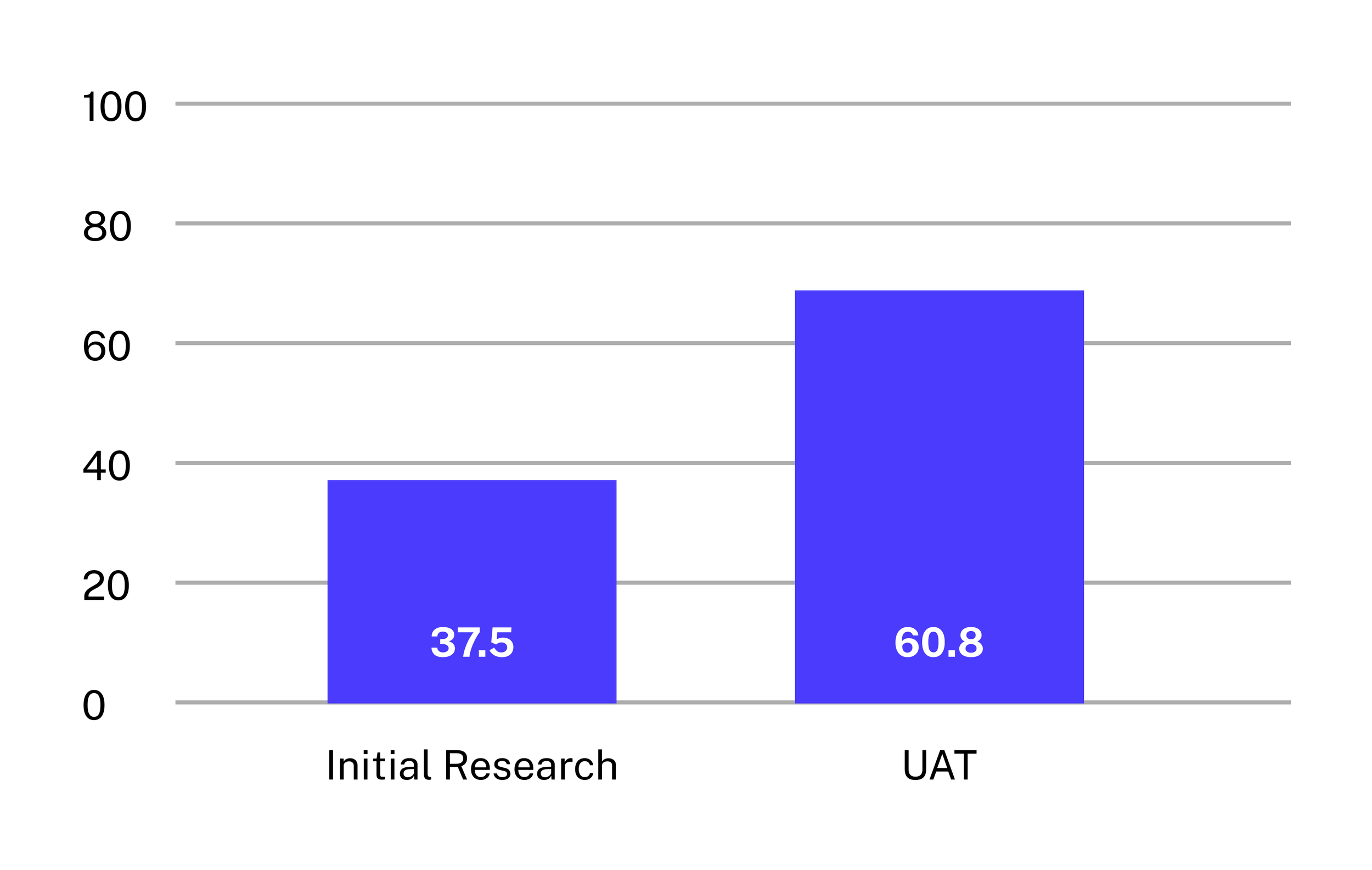
In the initial research phase, our product's usability was assessed through tests and interviews, resulting in a SUS score of 37.5%. After a targeted redesign, a reevaluation during User Acceptance Testing (UAT) demonstrated significant improvement, with the score rising to 60.8%. This progression underscores the impact of our redesign efforts.
Reflections and Lessons Learned
Working on this project, with its 20 features and 100 mockup pages, taught me a valuable lesson: even when the goal is to enhance responsiveness and refresh the UI without altering functionality, there's always room to improve usability and accessibility. Small UX adjustments can make a big difference, highlighting the continuous potential for refinement and betterment in design.
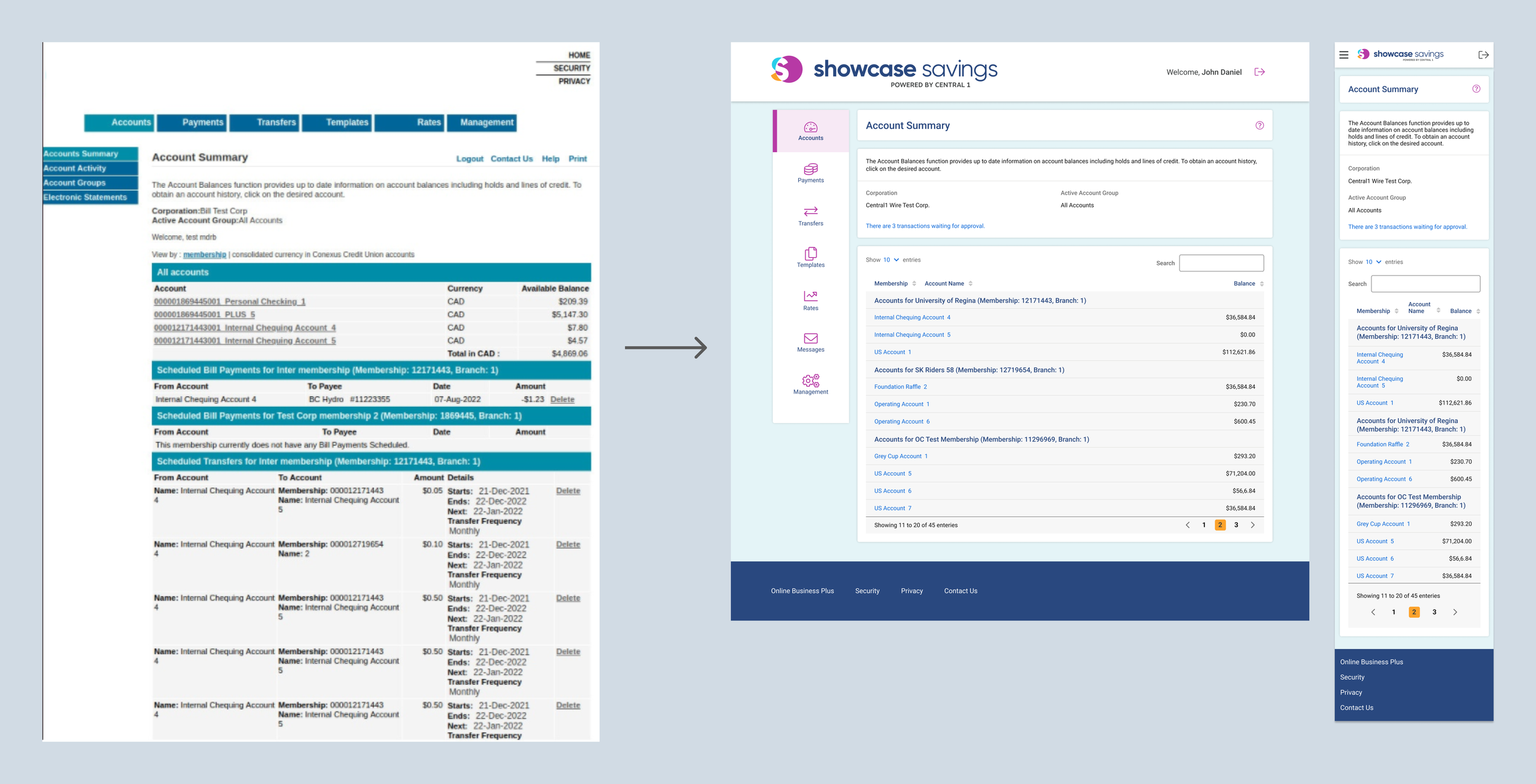
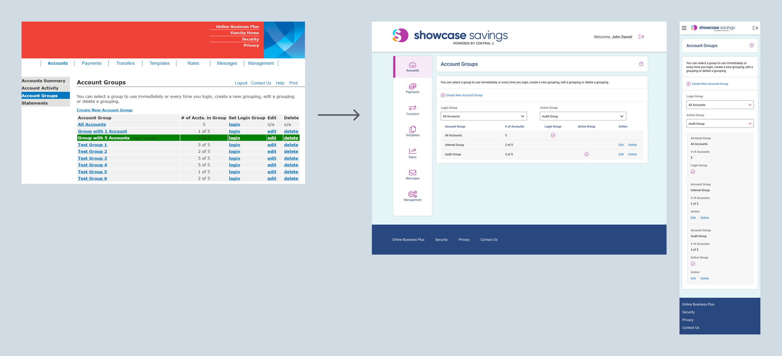
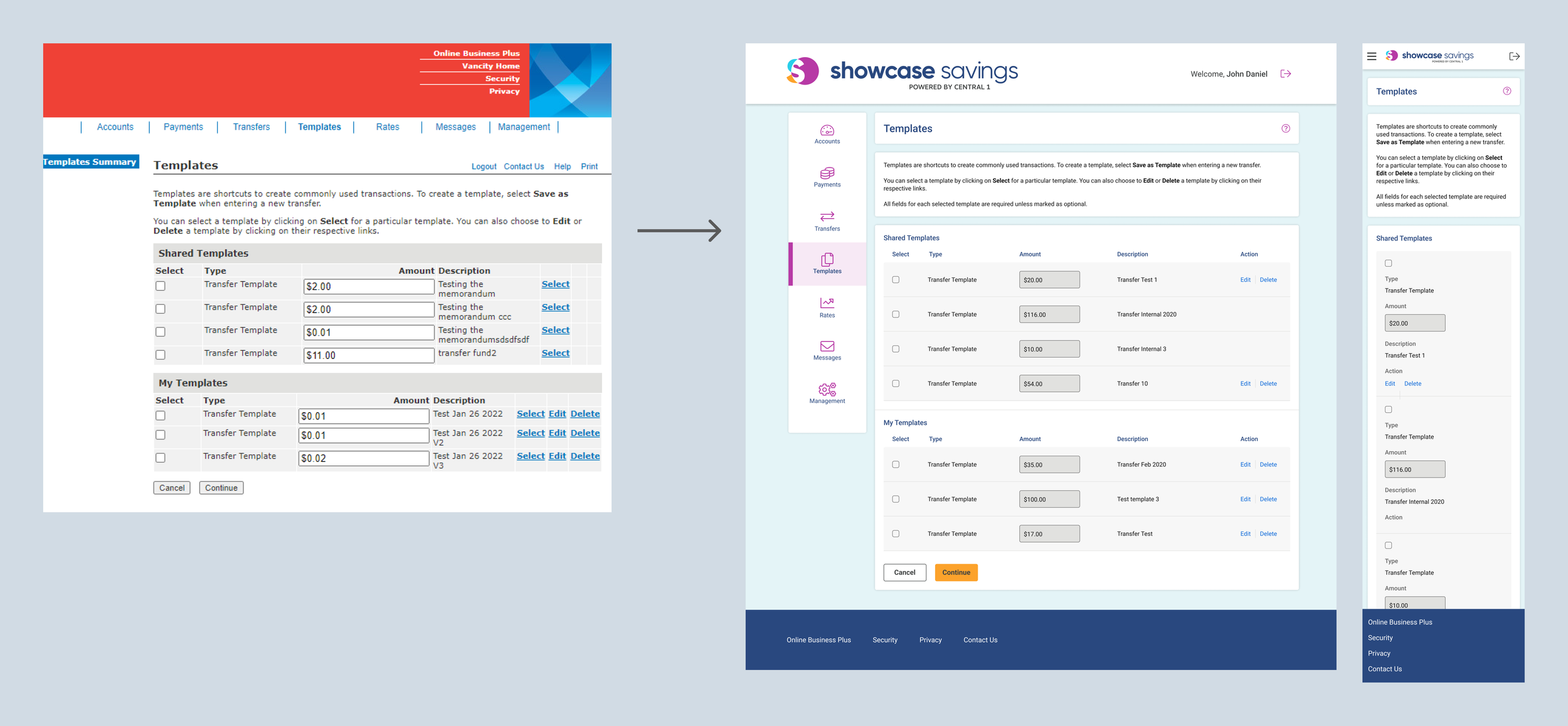
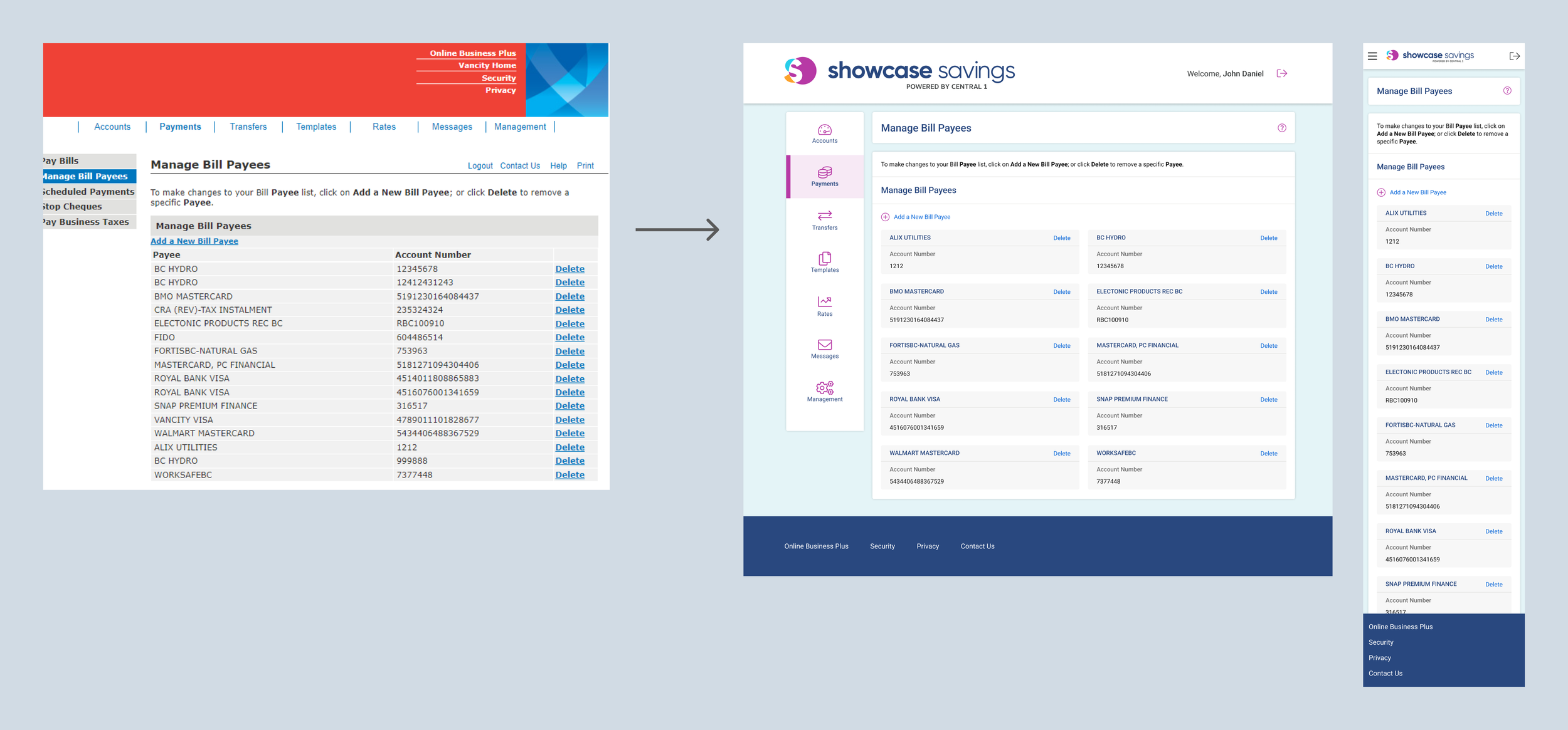
Before & After