B2B Credit Union Mobile App Redesign
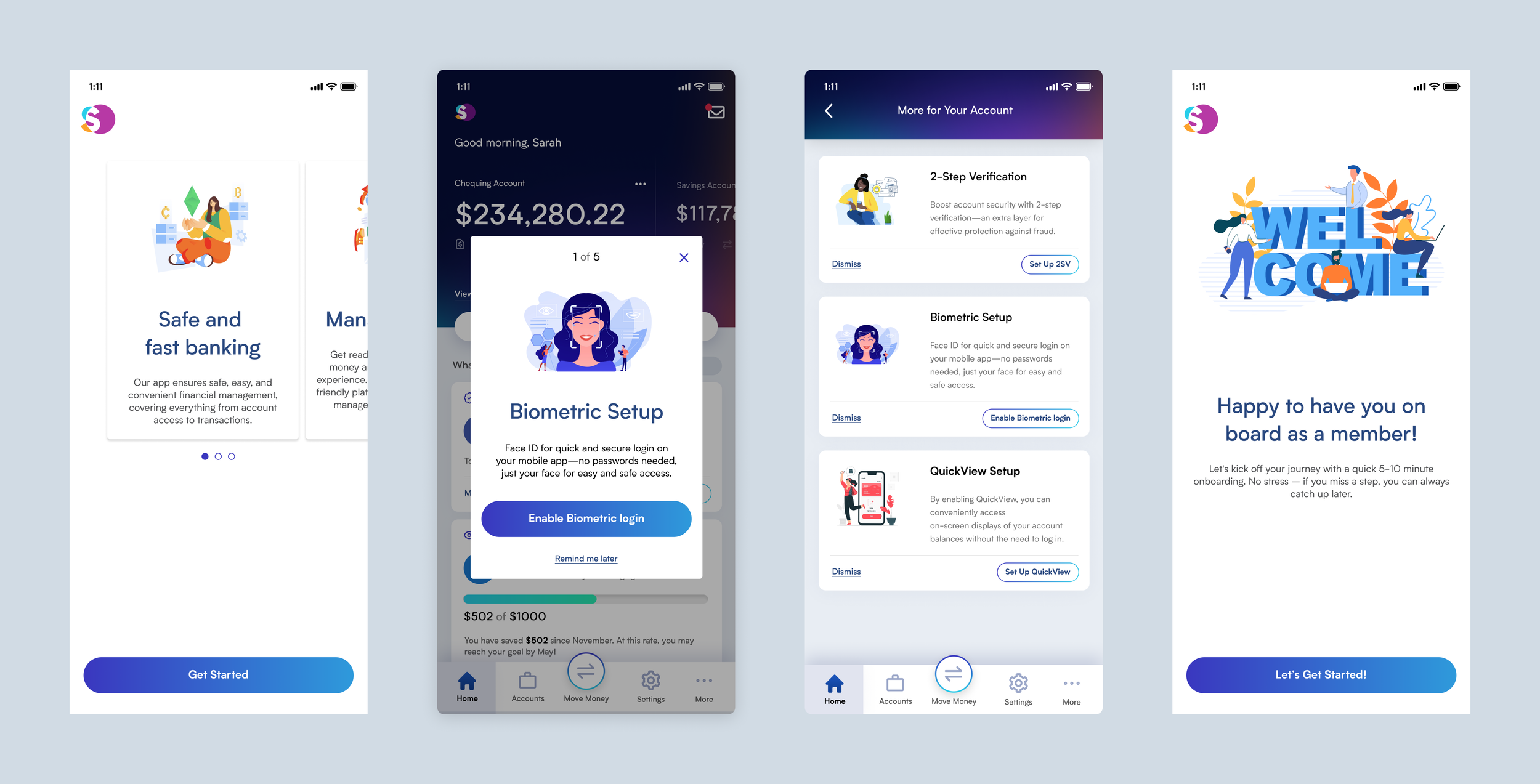
Leading Design Evolution - After the initial iteration by another designer, I became the main designer for the transformative journey of our Credit Union Mobile App. Leveraging a new platform, we redefined navigation and interface design. I focused on interface enhancements, experience optimization, and visual identity & engagement, setting new standards in intuitive B2B banking solutions.
My Role
Main UX/UI Designer
(Research, Ideation, Detailed Design, Test,…)
Team
• 2 UX/UI Designers
• Two outsourced agencies: one assisted with research, and the other provided design feedbacks and helped with Visual Design.
Client
Multiple Credit Unions
Background
For over a decade, each iteration of our Credit Union Mobile App has progressively enhanced user experience, from OG MD to Forge 2, leading to more user-friendly and efficient versions. The latest redesign marks a significant advancement, offering a superior experience. While building on established navigation, hierarchy, and flow, the new platform allows us to rethink and innovate beyond these traditional patterns.
Core Areas of UX Enhancement
Interface Enhancements
We enhanced the interface for a better user experience, making the app more intuitive and easier to navigate without altering its core functionality.
Experience Optimization
We implemented transformative UX changes, enhancing the user experience with functional modifications and reimagined features to better meet user needs.
Visual Identity & Engagement
We refined the app's aesthetics and integrated client branding, enhancing visual appeal, functionality, and user enjoyment.
Evolution of the Home Page Design
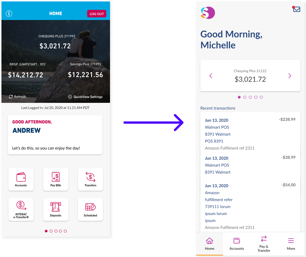
Initial Home Page Design and First Iteration (Before I joined)
• Home screen now features a swipeable carousel for quick account balance viewing.
• Navigation is now a thumb-friendly bottom tab bar for easier one-handed use
• "Recent Transactions" are now directly on the home screen for immediate account activity insights.
• Card-based layout for account information enhances readability and focuses on key financial data.
Home Page Usability Testing and Insights
Usability Testing Conducted: Partnered with a specialized agency for an in-depth analysis
Diverse Participants: 15 Credit Union members, active app users, from Ontario and BC, using both iOS and Android.
Testing Method: Interacted with a Figma prototype via goal-based scenarios, employing a think-aloud protocol for real-time feedback.
Home Page Research Outcomes
✓ 11/15 participants found the new app an improvement, with no declines reported. Average ratings increased from 7.1 to 8.5/10.
✓ Users found the purpose and functionality of the account carousel clear.
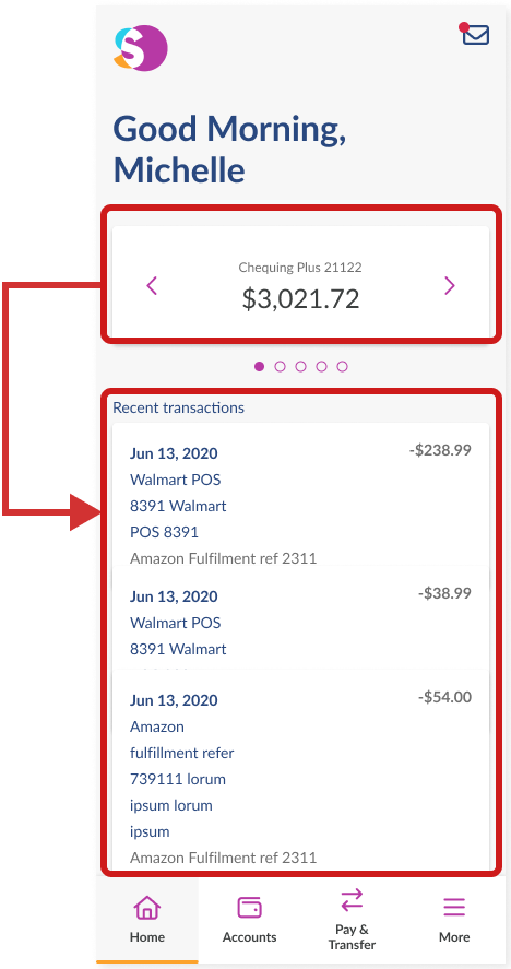
✗ 12/15 participants expected changing accounts in the carousel to update the Recent Transactions widget.
Proposed Solution
Linking the account carousel and recent transaction widgets to align with user expectations and perceived utility
Strategic Pause to Pivot
The mobile app modernization project was temporarily paused for three months by stakeholders, leading to a strategic pivot. Upon resuming, the project shifted towards a full redesign for a modern, user-centric experience. This new direction, driven by initial feedback and evolving expectations, aims to deliver an intuitive, visually appealing app that redefines mobile banking standards.
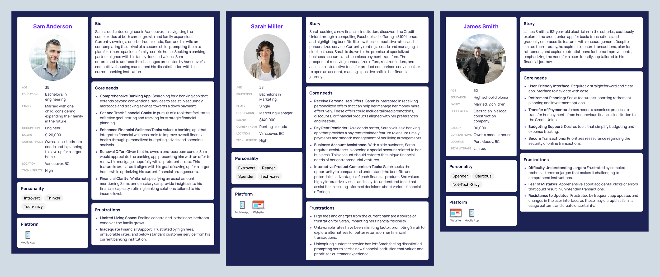
Updated Personas
Refinement of the Home Page
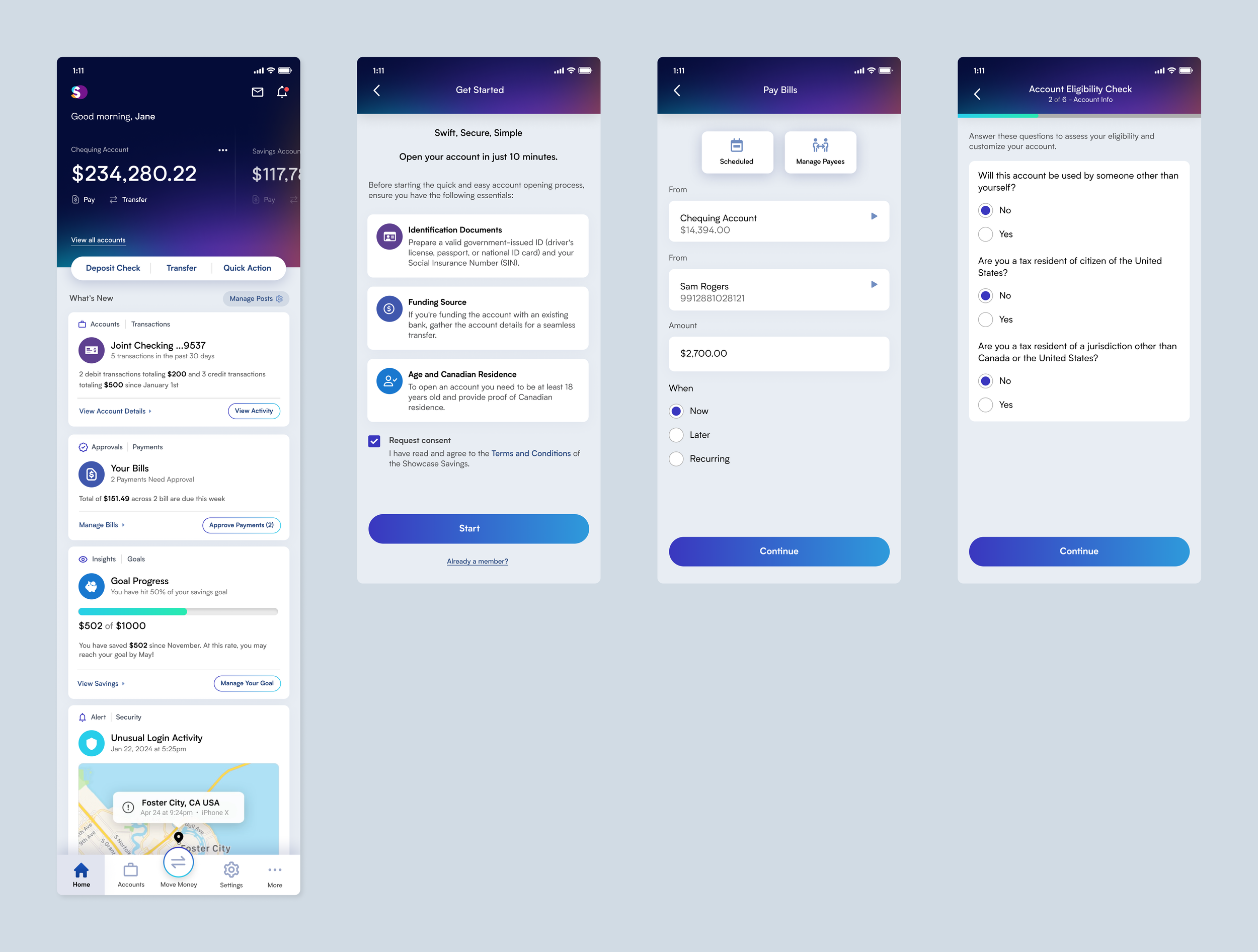
As the solo designer behind the latest mobile banking app, I crafted a design featuring a social media-like customizable feed, targeting younger users with an engaging interface. To refine the user experience and ensure the design's appeal, I collaborated with an agency that provided invaluable feedback, guiding iterative enhancements to meet the dynamic needs of a modern, digitally-savvy audience:
Modular, Customizable Home Page: Credit unions can personalize the home page with different components to resonate with users, much like customizing a social media page.
Engagement-Focused: The design encourages active user interaction, presenting financial information through a familiar, interactive feed.
Youth-Centric: Tailored to attract a younger demographic, the app makes financial management accessible and engaging, blending it seamlessly with their social media experiences.
Integrated PFM Tools: The redesign incorporates Personal Financial Management (PFM) features, including spending analysis, savings goals, and budget tracking. This functionality also potentially allows for the linking of external accounts, offering users comprehensive financial oversight within the app.
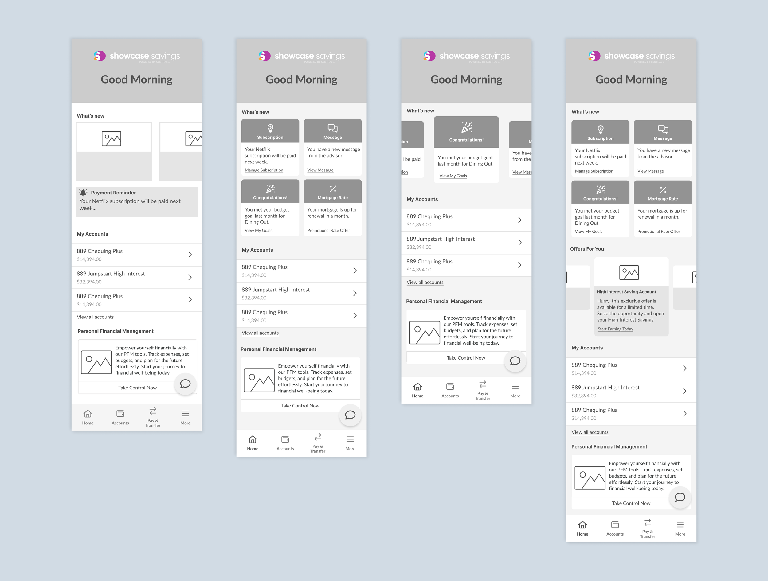
Ideation
Further Iteration
Based on the results from usability testing, the following design decisions were made for the final version:
• Adopted card-style information stacking, akin to social media feeds, for the final design based on usability testing.
• Prioritized account visibility at the top of the home page for quick user access.
• Enabled customization of card content for credit unions to meet diverse user needs.
• Integrated quick action buttons at the forefront for streamlined user transactions.
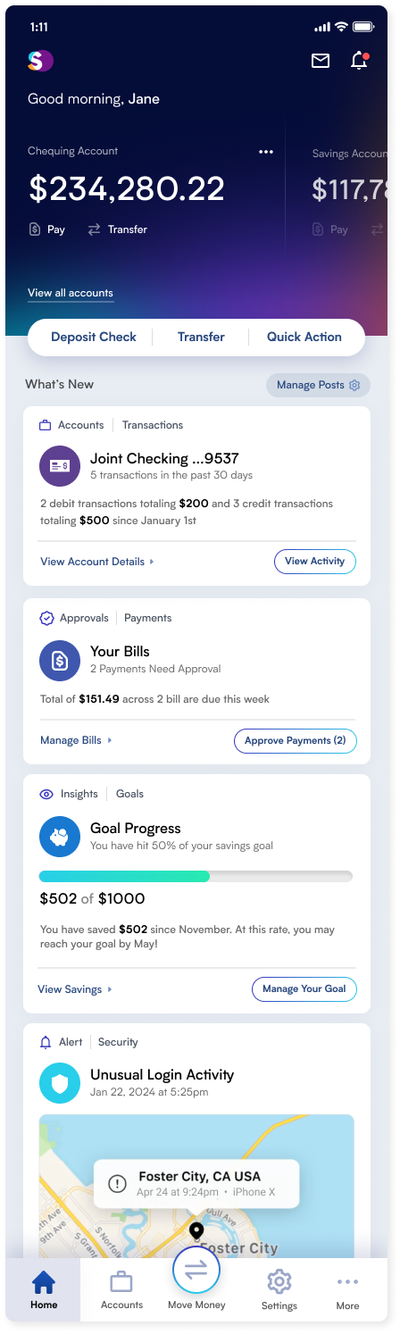
Current State and Future Plans
The redesigned mobile banking app has received enthusiastic feedback from stakeholders, validating our design direction. We're now gearing up to launch usability testing through a specialized portal to further optimize the home page. This testing is crucial for honing the interface based on user input, ensuring that the final design meets the practical and aesthetic needs of our audience, particularly the younger demographic we aim to engage.